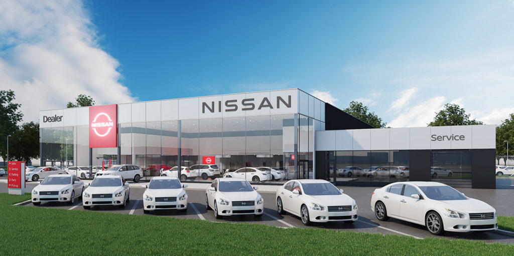
For the past 20 years, Nissan’s outgoing logo has been a beacon on its vehicles and so much more. It has served as an identity, a business card, a handshake and the first greeting between customers and the driving excitement that Nissan vehicles provide.
For decades more, Nissan’s logo has stayed true to a belief held by its founder Yoshisuke Aikawa, “Shisei tenjitsu o tsuranuku,” which he interpreted to mean, “If you have a strong belief, it penetrates even the sun.”
While keeping this essence alive, Nissan’s new “calling card” reflects the significant changes in society over the last two decades. It is a reimagination of the iconic Nissan brand logo for a new chapter.
![]()
Nissan’s new logo comes alive as it pivots to the future while staying proudly connected to its rich heritage, and tradition of innovation. The company name remains at the center of the logo, communicating an instantly recognizable brand that evokes past milestones and memories while also conveying evolution.
The journey began in the summer of 2017, when Alfonso Albaisa, Nissan’s senior vice president of global design, began to study potential changes to Nissan’s logo and brand identity. He set up a design team led by Tsutomu Matsuo, deputy general manager of Nissan’s advanced design department, to study everything from a subtle evolution to a complete reinvention. Albaisa offered the keywords “thin, light and flexible,” and set Matsuo and his team on their journey.
“Inspiration was drawn from breakthroughs in science, technology and connectivity. How these have brought fundamental changes to our customers,” said Albaisa. “As you can imagine, visions of digitalization started swirling in our heads.”
Over the next two years, the team sketched and plotted several iterations, always keeping Aikawa’s directive words in mind: “be passionate, be an innovator, be a
challenger.”
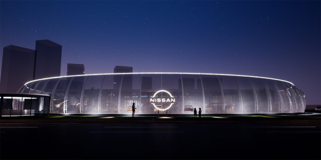
The team needed to consider several variables, including an early decision for the logo to be illuminated on upcoming all-electric models. This presented technical challenges, such as gauging the thickness of the logo’s outline to ensure a crisp impression when lit,and of course compliance with government regulations for illuminated elements on cars. The logo also needed to make a strong impression when not illuminated, such as when it appeared digitally or on paper.
No matter the medium, this new logo needed to unequivocally stand for Nissan, and do so with impact. After countless sketches and several mock-ups, the result was a logo with a two- dimensional impression. Looking more designed than manufactured, it has the flexibility to live in multiple worlds. The process started in 3-D and then developed in 2-D – the illuminated brand badge was drafted first, pulling the illuminated area out to represent the brand in 2-D form.
The overall effect of the redesign is a transition from a hard-edged, industrial feel to a refined, familiar and digital-friendly look. It signals the evolution of Nissan as not only a traditional vehicle manufacturer to a provider of mobility and services.
“The new Nissan logo communicates our guiding message, carried over from past iterations: If you have a strong, determined belief, it can even penetrate the sun,” said Matsuo. “At Nissan, this strong belief in the power of achievement has never wavered and can be seen in our pioneering efforts in electrification, driver assistance and digital connectivity. Our logo has to convey all of this in just a glance, to show our commitment to our customers, employees and society.”